BRAND IDENTITY - tablet
Your brand is at the heart of your company. We dive deep into your DNA and your larger goals so you can proudly wear your heart on your sleeve. A strong brand reinforces your value and drives performance, sales and customer loyalty. Designing logos is one of our greatest talents, and — done right — one of the best ROIs you can find. For fifteen years, our logo and identity systems have helped new businesses go from some customers
to so many customers they had to create a waiting list. We’ve helped global organizations find strong footing in a world full of competing noises so loud that potential audiences can be too overstimulated to engage. Our unique combination of deep empathy with our clients and an even deeper talent pool means that we not only hear what you need, we deliver it.
-
SHIFT
-

LAKE EDUCATION
-

PORTLAND COACHING COLLECTIVE
-
POWELL'S BOOKS
-

EMPEROR
-
INDIESPENSABLE
-

CENTRAL CITY BED
-

POWGIRLS
-

LAUREN LEVANT INTERIOR
-

KATYA MODA
-
MERCY CORPS
-

PIZZERIA OTTO
-

CENTRAL CITY CONCERN
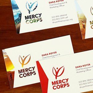
MERCY CORPS
Mercy Corps Rebrand
Year-long stem-to-stern rebrand of this iconic organization. Our assignment was to deliver a comprehensive brand book with visual identity, messaging guidelines and an online brand portal with templates, tools and brand photography, with the goal of rallying their global team behind a common cause and elevating their fund-raising profile. This year, Mercy Corps moved to the #6 position of NGO advisor’s top 500 NGOs in the world, up one spot since the previous year.
Logo | Business Card | Stationery | Typography | Color Palette | Graphic Element
Icons | Pattern | Illustration Style | Document Templates
CENTRAL CITY CONCERN
Central City Concern Rebrand
This ambitious non-profit’s projects include housing, health-care advocacy and employment mentoring, with a special sensitivity to culturally-specific needs. With endeavors this broad, the challenge was to communicate a succinct mission. We used iconography to distill the essential goals of the organization.
Logo | Typography | Color Palette
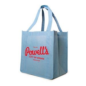
POWELL'S BOOKS
Powell's Books Logo for Anniversary Promotion
What started as a promotional one-off project ended as a complete rebrand for the largest independent bookstore in the world. Powell’s Books is often regarded as the premier voice for the non-chain bookstore, and we were delighted that they loved our project so much they adopted it as their permanent logo.
Logo | Illustration
KATYA MODA
Katya Moda Branding
This avant-garde clothing line asked us to take over their entire customer-facing visuals. We needed to distill their passionate vision into an elegant form that could be repeated across all media, from clothing tags to social media to trade show booths. Designing for designers is the ultimate challenge, and we so were particularly delighted to receive their post-project letter of thanks that included, “We have never felt so understood and so well-represented. You are simply the most professional and talented team we have ever worked with.”
Logo Fonts | Color Palette | Business card | Stationery | Packaging | Hangtag
PIZZERIA OTTO
Pizzeria Otto Logo Design
Named as one of the Oregonian’s best, this restaurant’s claim to fame is its dedication to classic Neapolitan pizza. We knew its logo had to express this essential element of the Pizza Otto character, and that it had to be something that translated well across the store-front sign, menu, t-shirts and website. This project took a lot of research, and we didn’t stop eating pizza until we got it right.
Logo | Color Palette
POWGIRLS & POWFEST
POWGirls and POWFest Logo Refresh
This impressive organization’s mission is to “provide a space where women can thrive as media makers.” Formed in 2008, POWGirls/POWFest was ready for an update to their logo. We were asked to imagine a new “spokesperson” for their larger organization as well as a youth figure for their girls’ educational program. So we put their iconic POWFest figure in a pantsuit and brought to life their POWGirl. Now an international film festival, POWFest is slated to screen 50 films from across the globe in 2017.
Logo | Color Palette
See the POWGirl Logo in Action.
Animation by Fashionbuddha.
LAUREN LEVANT INTERIOR
Lauren Levant Interior Logo Design
Widely known for their kitchen and bath spaces, LLI has been awarded over 20 national trophies in the last three years, including Viking Appliances National Designer of the year, HGTV’s top 10 American Designers Under 35, and Best of Houzz 2016. LLI has been featured in Elle Decor, Architectural Digest, Home Design Magazine, the Washington Post, and hardcover publications such as The Kitchen Bible. We were honored when LLI recruited us to translate the brand’s unique modern style into an updated logo. The client was so pleased with the result that she said, “I didn’t understand what this process was going to strengthen in me and my business until I went through it with Lenore Graphics. I couldn’t be happier.”
Logo | Font Package
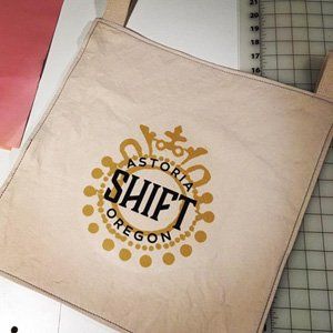
SHIFT
Shift Logo Design
Shift’s dedication to exquisite craftsmanship and personal attention needed a human touch without sacrificing professionalism. For this project, we were especially sensitive to budget constraints, not only in our scope of work, but in future incarnations of the logo. Our team focused on using fonts that are readily accessible and inexpensive, and limited the palette to two easily-reproduced color specifications.
Logo | Font Package | Color Palette
PORTLAND COACHING COLLECTIVE
Portland Coaching Collective Branding
As a team of professional service providers, we had a special affinity to this project. Portland Coaching Collective houses a wide variety of disciplines that needed to be harmonized into a single clear organization. We were very happy to hear back from the client that our “expertise in multidisciplinary arts brought added value to the project” and that we were “super communicators and wonderful about including [them] in the process.”
Logo | Font Package | Color Palette | Business Card | Stationery
LAKE EDUCATION
Lake Education Branding
Lenore Graphics brought form and clarity to the client’s inspired vision for nature-based educational programs for camps
and schools. We designed a marketable product in the form of the Camp Nature Kit containing lesson plans, teachable
facts and materials lists, all handsomely packaged on waterproof cards inside a nature-friendly wooden box.
Logo | Font Package | Color Palette | Promotional Materials | Packaging | Signage
CENTRAL CITY BED
Central City Bed Branding
CCC asked us to brand their line of furniture, which includes features meaningful to a specific demographic. The intention of this line was at once practical and the moral extension of CCC’s mission. The challenge was to design something that was coherent with the larger brand, but distinctly its own enterprise.
Logo Business | Card Stationery | Promotional Materials
EMPEROR
Emperor Logo Design
Private label distiller Emperor asked us to update their logo. Their customers reported that Emperor’s dated logo made either no impression, or a negative one. The logo needed to get right to the heart of the client’s core competency: distillation. Lenore Graphics explored ways to represent the process of extraction, a concept they responded to immediately. Their new logo communicates droplets, beakers, and organic constituents in an elegant and compelling form that our client is very pleased with.
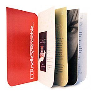
INDIESPENSABLE
Indiespensable Branding
This popular subscription club for book-lovers needed a logo that communicated two critical elements: their trend-setting title selections and the fine quality of their limited editions. Balancing these elements also meant creating a visual that stuck with customers. Indiespensable is now selling its 65th volume, and is capped at 2,000 subscribers with a waiting list. We are extremely proud to have been a part of that. And the branding we created is still potent eight years later.
Logo | Color Palette | Collectible Booklets | Promotional Materials